High-Converting Landing Page for Residential Launch
Client — Harsh Wadhwa
About this project
The Challenge
The client was running paid campaigns across Meta and Google but converting less than 1.2% of visitors into enquiries. Traffic was decent, but the landing page was a generic website page with navigation, multiple CTAs and a form buried below the fold. Buyers landed, looked confused and left.
Our Approach
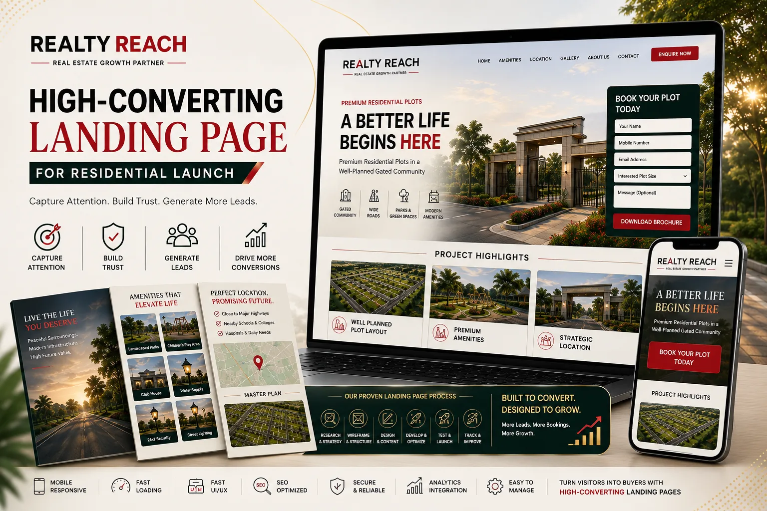
We designed a focused, single-purpose landing page built around one goal: the enquiry. The page eliminated navigation, used a clear headline stating the project offer, showed the price range and configuration upfront, and placed a simple two-field form (name + phone) above the fold. A WhatsApp option was added for buyers who prefer chat.
Trust signals were placed strategically — RERA number, project status, location map and a short testimonial from an early buyer. The page loaded in under 2 seconds on mobile, with compressed hero images and no unnecessary scripts.
Execution
The landing page was designed mobile-first because over 80% of the client's paid traffic came from phones. We tested three headline variations and two form layouts in the first two weeks. The winning combination — a price-led headline with a minimal form — produced a 3.4x improvement in conversion rate.
Google Ads campaigns were restructured to send search traffic to the new page instead of the generic website. Meta retargeting campaigns pointed to the same page with a "Last Few Units" urgency message.
Results
Conversion rate improved from 1.2% to 4.1% within the first month. Cost per enquiry dropped by 58%. The client stopped losing paid traffic to a weak page and started converting the budget they were already spending. The page continues to produce enquiries as the primary landing destination for all paid campaigns.