Brand Identity for a New Residential Developer
Client — Ganga Kumar
About this project
The Challenge
The client was launching their first residential project and had no established brand identity. Their logo was a generic template, their ad creative used inconsistent colours and fonts, and their sales collateral looked unprofessional compared to established competitors. Buyers who visited the site or saw their ads could not distinguish them from other developers in the same micro-market.
Our Approach
We started with understanding the project positioning — a mid-premium residential project targeting young professional families. The identity needed to feel modern, trustworthy and aspirational without being overly luxury. We developed three logo concepts, refined the chosen direction through two rounds of feedback, and built a complete visual system around it.
Execution
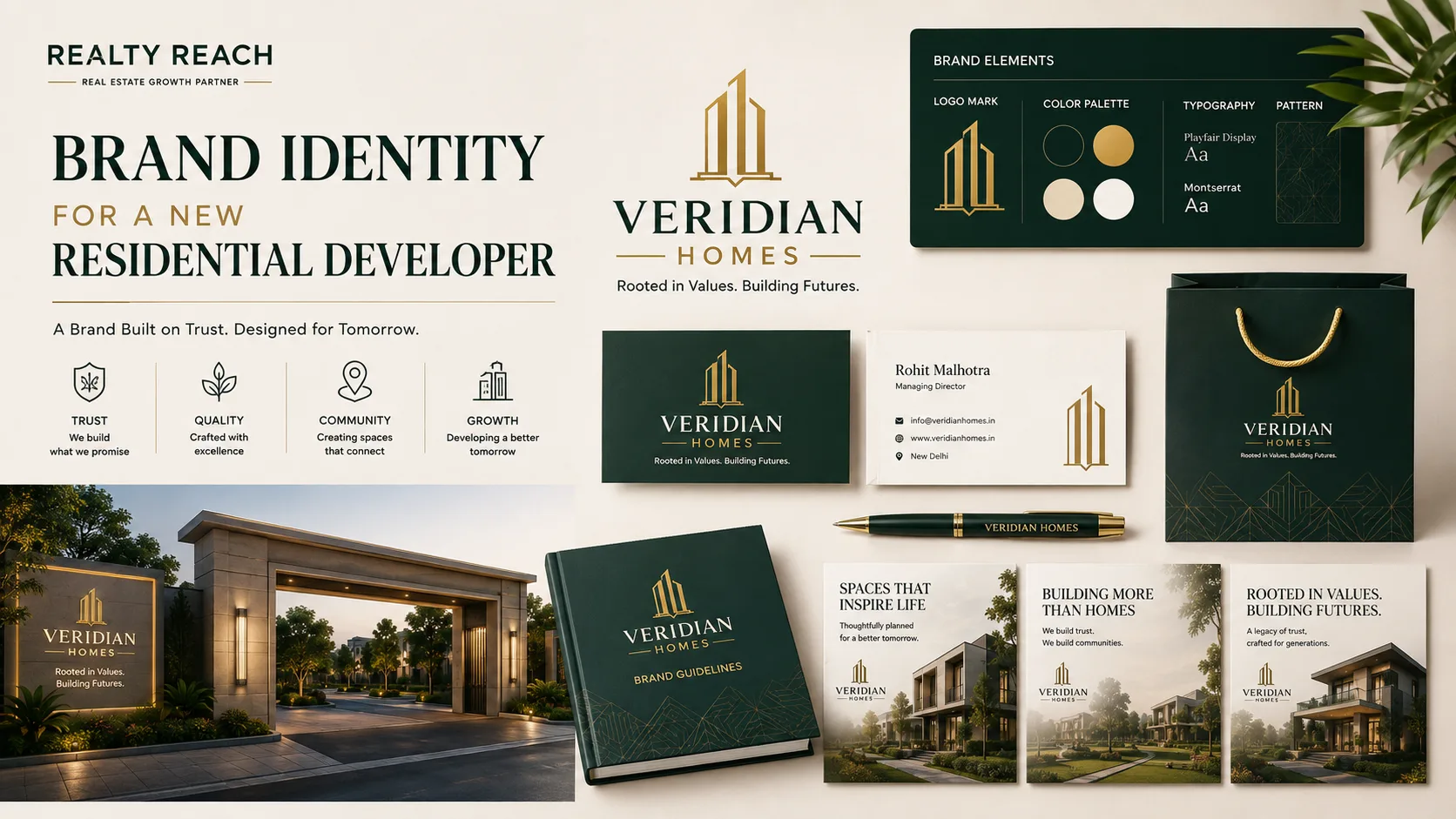
The identity system included: primary and secondary logo marks, a colour palette (deep blue for trust, warm gold for premium feel), typography pairing (clean sans-serif for headlines, readable serif for body), and imagery guidelines. We created a brand guidelines document — a practical reference anyone on the team could follow.
We applied the identity across all touchpoints: website redesign, ad creative templates (Meta, Google, YouTube), social media templates, sales brochure layout, site hoarding design and email signatures. Every piece looked like it belonged to the same brand.
Results
The client reported that buyer perception shifted noticeably — enquiries mentioned the "professional" look of the brand. Social media engagement improved as posts became visually consistent. The brand guidelines document reduced creative turnaround time for new campaigns from days to hours. The identity continues to work across every new project the developer launches.